
Visuals / share.page
share.page branding and full site redesign.
-
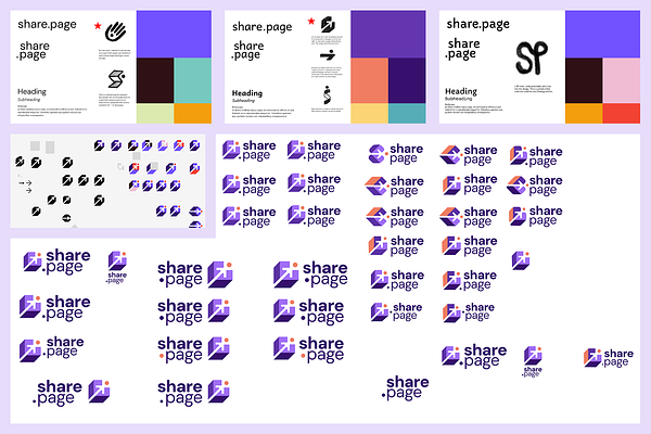
Our logo explorations based on what the client had in mind.
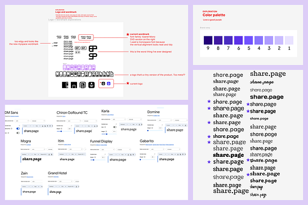
The client came to us with a few ideas of how they wanted their brand to feel. They knew they wanted purple to be a prominent color, clean and tidy typography, and fun custom illustrations. They had taken some first steps in the brand discovery process that helped us figure out how to move forward towards a design that would feel authentic to them and their company. With that direction in mind, we presented them with 3 different directions to pursue.
-
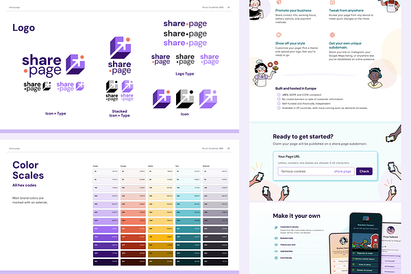
The final logo mark and colors
After many explorations and iteration, we landed on a logo that felt correct for the brand and had a fun, playful feel while still being professional. The logo mark was based on the share icon of an arrow, a common element when sharing a link. It was enhanced through color, shape and form to feel more dimensional and exciting. From the design of the logo, we were able to pull out colors and build out a full color palette. With those elements in place, we were able to begin the illustration process to wrap up their brand feel.
-
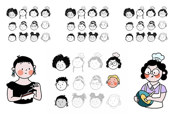
Illustration sketches and samples of final work
The way we illustrated this brand was very important to us as we wanted the illustrations to be inclusive to gender, nationality, and ability. We started off by sketching a few different versions of our people, using the circle from the logo icon as the base of the face shape, thus tying the two elements together in a subtle way. We tried different eye types, mouths and levels of complexity. In the end, we chose a simple, one color eye shape and simple flat color designs that felt sweet and approachable.
-
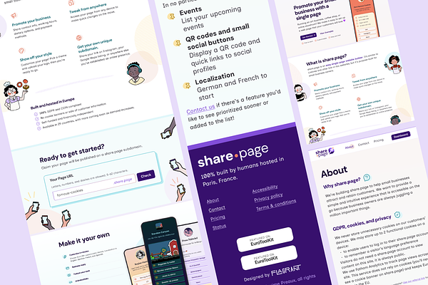
Marketing site design
We designed the share.page marketing site to showcase branding with deep purples, airy pastels, and juicy typography. Custom illustrations impart the charm and openness of the brand and intersperse with large visuals showcasing the product’s versatility. Diagonal lines and organic circle shapes bring the visual language from the illustrations into the page design to create continuity throughout the site.
-
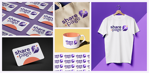
The brand applied to the real world
To give the client an idea of how they could extend their brand beyond the website, we created mock ups of the brand applied to real world objects that could be giveaways to customers, staff swag, or business cards.


