The Dark Art of Designing for Dark Mode
From a talk I gave on September 20, 2025, at XO Ruby New Orleans.
If you use dark mode on any of your devices—or even if you don’t—you’ve probably seen a lot of interfaces and websites in dark themes.
Framer, Google Fonts, Linear’s website, and many others showcase dark mode designs, even when you view them with “light mode” on:

There’s a surprising amount happening here. Even as a professional designer who uses dark mode all day every day, I didn’t fully intuit what design principles to follow when designing for dark mode.
After adding dark mode to several client products, I’ve gathered useful guidelines to follow when designing for dark mode.
Color terminology 101
Before we get to guidelines and the Dark Mode Dark Arts, let’s step back and define some key color terminology.
There are many ways to talk about, identify, and work with color. A lot of how we talk about and work with color depends on the medium.
- CMYK, color spaces, Pantone - These may indicate you’re dealing with printed materials.
- Subtractive color vs. additive color - Pigmented color (paint, ink, etc.) is subtractive, where mixing all colors gets you something brown or black. Colored light (theater lighting, etc.) is additive—mixing all colors gets you white light.
- P3 and other color gamuts - Color gamuts often come into play when we’re dealing with digital devices and how many colors they can display.
- HSL / HSB / RGB / RGBa / Hex - Any and all of these are used on the web and when designing software.
Since we’re talking about software UI and dealing with color on screens, we’ll focus on #4—specifically HSB, (hue, saturation, and brightness), which is what I use to manipulate color when designing.
All color is a result of how our eyes physically process light waves. Each color has a different wavelength in the spectrum of light.

In color theory, we often talk about “the color wheel” which is really just the spectrum of light twisted around so that the violet and red ends are joined.
Hue is often what we mean when we say “color”—like red, green, blue, yellow. Hues have different wavelengths in the spectrum of light. Hue is the “H” value in both HSL and HSB.
Here you can see the different H values for each color:

Saturation can also be called a color’s intensity. It’s a measurement of how different a color is from pure gray. Saturation isn’t really a matter of light and dark—it’s more how pale or intense the color is.
Here you can see high saturation on the left moving to low saturation on the right, with a constant hue—or H value—of 359:

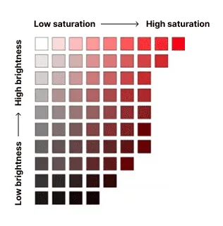
When we talk about how light or dark a color is, we’re talking about brightness. The higher the brightness of a color, the more light it emits on a screen.
Here’s a chart showing how brightness and saturation impact a color (from Leigh Cotnoir):
When I work with clients on design projects, I’m often given just two or three core brand colors from which I derive a full color ramp of more shades. HSB is what I use to do that.
Defining the extended color ramps for a brand’s palette is a crucial early step in design projects to ensure there are enough shades to work with in order to meet accessibility guidelines for color contrast.

I manipulate the saturation and brightness of a brand color to make a color ramp with many steps. For this purple palette, the hue—the H value—stays the same.
As you move from top to bottom (from 50-950):
- Hue stays the same
- Saturation increases
- Brightness decreases
This mimics how light and shadow impact color in the real world. In these examples from Erik Kennedy, the area of shadow has higher saturation and lower brightness than the area not in shadow:

Color and accessibility
Now that we’ve talked about hue, saturation, and brightness, let’s cover some basic accessibility guidelines when it comes to color.
Fortunately, there are some well-documented accessibility standards we can follow. If you’re not familiar with WCAG, it stands for the Web Content Accessibility Guidelines. WCAG standards aim to make web content more accessible to people with visual, auditory, physical, cognitive, and neurological impairments. So it’s not just about color.
WCAG supplies us with guidelines for color contrast ratios—the difference in contrast between two colors. For example, in the second button the dark text has a contrast ratio of 9.5 to 1 against the green button background. The same green button background has a contrast ratio of only 1.2:1 with the gray page background.

Did you know that there are several different types of colorblindness? It’s another thing to factor in when working with color. As you can see with some of these oranges, yellows, greens, and reds, color contrast might help with legibility, but high color contrast alone may not help with color differentiation for certain types of color blindness:


That’s why one of the standards from WCAG is not to rely on color alone as the only way to convey information.
WCAG cheat sheet:
- Don’t use color as the only way to convey information
- 3:1 - Buttons against a background
- 3:1 - Large text (24px+)
- 4.5:1 - Normal text against a background (any size)
- 3:1 - Icons & graphs, any size
- 3:1 - Focus rings, UI elements, or other signifiers
But even if all you’re going to do is comply with contrast ratios, it’s a lot to consider. Especially since this is not a complete list.
As if that’s not complicated enough, when you add dark mode to your website or application, you effectively double the amount of color combinations that must be accessible.
I’m not going to go in depth about the solutions for dealing with this complexity, but if you’re interested in knowing more, you can read my post on setting up color systems with color variables.
Color + your brain
Color perception and relativity
I said earlier that all color is a result of how your eyes physically process light waves. That’s true. What’s also true is that colors are the way your brain by use of your eyes interprets those colors in a given context.
Color is perception. Yes—the physical mechanisms like rods and cones in your eyes and wavelengths of light—but there’s an added influence given how our brains process those physical inputs, like:
- Proximity to other colors
- The color temperature and amount of light in our given context
- The way light reflects off of something (your glass phone screen, shiny vs. matte paper, etc.)
This could mean that the kind of light a color is seen in impacts the colors we think we see.
Is this dress black and blue? Or is it white and gold?

I bet you have some personal experience with this if you’ve ever looked at your phone screen when you’re in a dark room.
Our color perception is influenced quite literally by what colors appear next to each other. Many such experiments in color and perception were designed by Joseph Albers in his book Interaction of Color.
For example, focus your eyes on the small rectangle in the center of the top (blue) half of this image. After your eyes rest there for a few moments, the small rectangle in the center of the bottom (red) half appears similar in color to the one you’re focusing on.
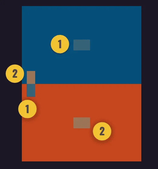
In fact they are very different colors. But we don’t perceive them that way because of the field of color surrounding them.
The small boxes next to 1 and 1 are the same color. And the small boxes next 2 and 2 are the same color. When you change the colors next to or surrounding them, it impacts your perception of the color.
This notion of perception—or what I like to call “color relativity”—is especially relevant for dark mode. Your punchy, vibrant brand colors or the reds you’re using to grab the user’s attention for errors may read really differently when they’re on a dark background.
A bright red or a punchy blue on a light background can feel muddy and against a dark background:

Yes, checking our color contrast ratios can guide us. But there’s a little more going on here. The perceived saturation of a color is not constant. It varies depending on the surroundings and light a color is seen in.
When we’re in the dark, closer objects are brighter
Another way that our brains interpret and perceive information from our eyeballs has to do with light sources and shadow. In daylight, items that are more distant appear lighter in color.

Photo of mountains from Mario von Rotz on Unsplash.
But in the dark, items closer to a light source appear lighter in color. Given the way we rely on light in the darkness to help us see, items closer to us and our eyes (and a nearby light source) appear lighter in color.

Photo of dark hallway from Qiu MenFeng on Unsplash.
This perception informs one of the key principles of designing for dark mode. In light mode we can rely on shadows alone to convey elevation. But in dark mode, items that are “closer” to us in the UI should get a lighter background to create that sense of elevation and proximity.
Even though the differences between a “closer” menu and a background behind it may be quite subtle, it feels quite natural to our eyes and our brain, and when done incorrectly can contribute to a dark mode implementation feeling “off.”

Image from Dark Mode UI: 7 Best Practices
For example, this drop down menu on Linear’s website pops over the top of the page behind it. To give that sense of “closeness” to a light source near our eyes, it uses a lighter gray background than the page behind it:

Common misconceptions
If you haven’t spent much time thinking about or dissecting why dark mode looks the way it does, it might seem pretty straightforward. What’s the big deal?
Let’s talk about some of the common misconceptions.
“Just invert the colors”
Isn’t dark mode just inverting all the color? Not exactly. That would mean any UI elements with shadow would have a soft glow around them.
True color inversion might be fine for white or black elements like backgrounds and text. But it will also change things like brand colors, which are commonly used for attention-grabbing UI elements like buttons. And we know better than to muck around with brand colors, don’t we?

“So…just invert the color ramps then?”
So if we don’t do a true inversion, couldn’t we just invert the color ramps and flip where the dark colors and light colors get used? So dark greens flip to light greens, light greens flip to dark greens, and all the colors for dark mode are…well…darker?
Not exactly. That gets us that super-saturated “muddy” feeling in dark mode, like with this dark red alert, which doesn’t have much contrast against a dark background:

Depending on the specific hue of the color ramp, inverting the light colors to dark ones from the same color ramp may mean that something unimportant (like our green success alert) steals a lot of visual attention from primary content or a call-to-action button.
“Can’t we just throw Tailwind’s ‘.dark’ class on it and call it a day?”
Haven’t tools like Tailwind solved this problem for us? Well…yes and no.
As Tailwind’s dark mode docs indicate, you can add Tailwind’s “.dark” class to the body of a page. But that assumes that you’ve specified the right color for every element you want recolored for dark mode. Or that you’re using pre-styled Tailwind components without customization or any additional brand colors.
Tips & tricks for dark mode
So what parts of a color’s formula do you manipulate for a successful design in dark mode? What tips and tricks can you follow to do dark mode the “right” way?
1. Avoid using saturated colors.
It can be hard to pass accessibility requirements with saturated colors on dark backgrounds.
Highly saturated colors will feel too intense in dark mode. Because of the way we perceive color, a desaturated color will feel more intense when it’s on a dark background. Lower saturation will still “feel” colorful in dark mode.

Reserve the intense, saturated colors for expressing brand or for call-to-action situations where you really do need to grab attention.

2. Don’t just invert your light mode colors.
Don’t just invert your light mode color scheme. It won’t necessarily have enough contrast to meet accessibility standards.
Be patient and create a dark-mode-specific color palette that has enough contrast and is pleasant to the eye.


Just inverting light and dark steps your color palettes will likely result in icons or buttons not meeting contrast requirements against dark backgrounds.
3. Avoid using pure white or pure black.
White text on a pure black background can be challenging or painful to look at with certain vestibular or vision impairments.
4. Communicate elevation with lighter surfaces.
In light mode, we use shadows to communicate depth. The higher the surface is, the closer it is to the “light source” and the bigger shadow it casts.
This doesn’t work the same way in dark mode. But we can use the same “light source” theory and apply it to surface color.
For elements in the UI that are “in front” like fly-out menus or dialogs, use soft grays rather than dark blacks and bright whites. Shadows will still show on grays. It will still feel dark, but much softer and nicer to look at.
If you’re using grays and not blacks, shadows still help create depth in addition to the gray scale giving that sense of elevation:

5. Use a robust gray palette that carries some of your brand color
Consider creating harmony with other UI elements by creating a gray palette that isn’t totally neutral, but carries a very desaturated version of a brand color. It will feel more sophisticated and easier on the eyes.

Try combining a primary brand color at low opacity with neutral grays to create a gray palette that carries a branded hue.
Conclusion
Designing for dark mode can be surprisingly complex. It requires an understanding of how our eyes perceive color and how to mimic colors in the real world by manipulating the saturation and brightness of colors.
By using HSB, we can:
- create a gray palette that carries some brand color for added harmony
- apply lighter grays to “closer” surfaces to convey elevation
- avoiding saturated colors except in instances where we want to draw attention
I hope you’ve learned a little something about working with color. Need help with dark mode designs or working with color on your project? Get in touch!
Resources
- Color in UI Design: A (Practical) Framework by Erik Kennedy on constructing color palettes and understanding color relationships with hue, saturation, and brightness or HSB
- Hue, Value, Saturation—a great explanation of different color terminology (beyond just HSB) if you wanna nerd out
- The Surprising Science Behind Color Codes by Patrick Woodhead
- Seven Myths of Color Contrast Accessibility from UX Movement exposes when WCAG formulas for contrast ratios actually don’t help
- Dark Mode: how to come over to the dark side by the team at Redmadrobot Design Lab
- Material Design guidelines for creating dark themes—a good summary of putting all the principles together in an extremely practical way without having to go deep on the theory
- The same guidelines for iOS
- Session from WWDC 2019 on dark theme design for iOS
- Dark mode UI design—7 best practices by Ondřej Pešička
- Color palette generators and tools: Colordot, Pokemon Palettes, Colorlab.dev, ColorBox, Material Design color tool, Accessible color palette builder, Happy Hues
- Color contrast cheat sheet with a list of many other contrast-oriented accessibility tools and resources
- Color simulator tools: Sim Daltonism for Mac, Color Blindness Simulator plugin for Figma
- Color contrast tools: Lighthouse, Stark - Contrast & Accessibility Checker plugin for Figma
If you’re looking for a team to help you discover the right thing to build and help you build it, get in touch.
Published on November 7, 2025