Why you need a navigational thesis for your product
Part 1: Signs your navigation and wayfinding is failing
Your product isn’t the destination, it’s the airport
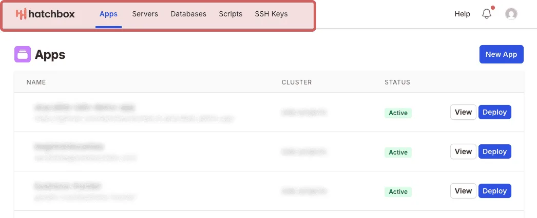
Navigation design for websites and digital products typically follow common, well-known UI patterns. Product teams adopt and adhere to these common patterns. These patterns help users orient quickly, contributing to a sense of ease and efficiency when using a product.
You’re probably familiar with some of them including:
-
horizontal top navigation or a left sidebar with 5-7 links to primary pages
-
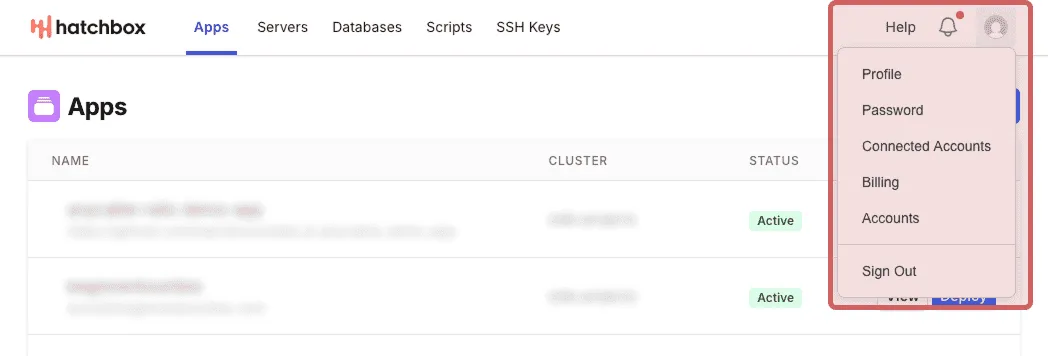
a user avatar you can click to find account information, settings, or a log out link
-
subnavigation like a sidebar
-
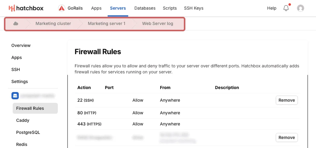
clickable breadcrumbs


These navigation patterns are a lot like wayfinding systems in airports. Even if you’ve never been to a specific airport before, you’ll find well-lit, legible signage to guide you to key services such as trains, buses, escalators, restaurants, bathrooms, or wherever you need to go. Don’t speak the language? No problem—pictograms and arrows still help you find what you need.
But…have you ever been to an airport that’s partially under construction? You follow signage for the train, but your path is interrupted by a “pardon our progress” construction zone. Suddenly you arrive in an area with lots of walkways, exit doors, and escalators and no indication of the train anywhere. Or worse, you see an arrow for the train, keep walking, and suddenly there’s a near-identical sign with an arrow pointing in the opposite direction.
If anything about the signage is broken in the chaos of a large airport, there’s not much of a remedy—just frustration, overwhelm, and a lot of wasted time (maybe time between flights you can’t afford to waste!). Perhaps, like me, you also harbor a unique and visceral hatred for particular perpetually-under-construction airports and try to avoid layovers there at all costs (looking at you ATL and CDG! ಠ_ಠ).
Your product isn’t the destination, it’s the airport. Users are passing through on their way to something else—some work task, some meeting, some end goal. If your wayfinding signs have conflicting arrows or strange dead zones, your users will quickly feel tired, frustrated, and overwhelmed. Would they agree to another layover here?
If you aren’t careful about the design of your navigation and wayfinding, your product could start to feel like a perpetually-under-construction airport—one they make note to avoid in the future.
Common anti-patterns
When we’re designing for our clients, we often encounter the same issues with wayfinding and navigation time and time again—common anti-patterns and smells that seep into products as they grow.
As designers on a small consulting team, we are often those new team members with fresh eyes. Over the years and across work with many clients, we’ve identified a few of these “smells” and anti-patterns that crop up over and over again:
- Too many items in navigation with no clear groupings; or the inverse—too few items that makes it hard to access frequently used areas
-
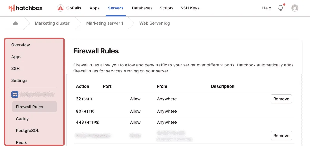
Page title text doesn’t match navigation text
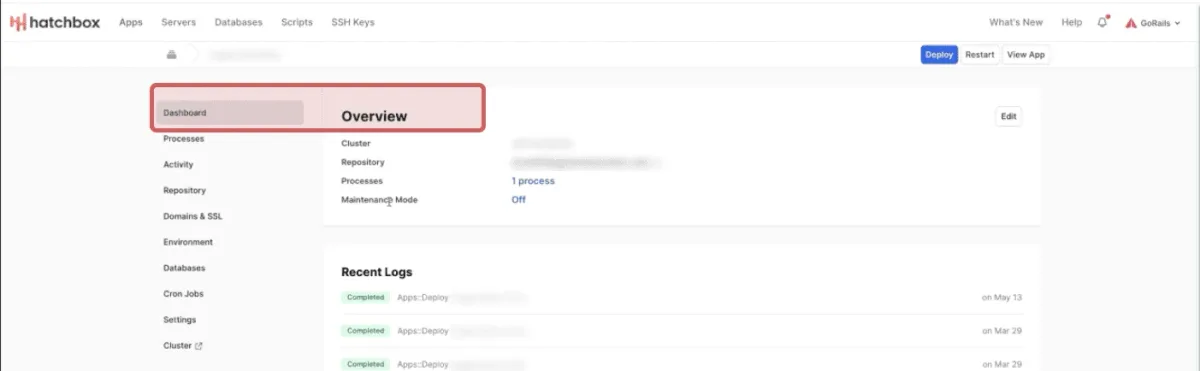
Caption: There’s no ‘active page’ indicator in the top nav to help the user understand where they are in the application. ‘Dashboard’ is active in the subnavigation sidebar, but the page title is ‘Overview’, with breadcrumbs showing the cluster name.
- Separate concepts or areas use the same nouns, names, or icons; or the inverse—the same concept uses different nouns, names, or icons in different areas
- Inconsistent navigation items, styles, or links depending on which page or part of the app you’re in
- Conflating or misusing common navigational patterns—for example, using a breadcrumbs component to show relationships between objects rather than a way to navigate through different levels of information hierarchy
- No guidance or agreed upon system for determining where to add a new nav item to the product


Some signs, smells, and symptoms of the above anti-patterns:
- Complaints or points of confusion from users that follow a trend
- Over-documentation and troubleshooting scripts
- Concepts, mental models, or parts of the product always need to be explained to new team members
What is a navigational thesis?
A navigational thesis is a map of how different navigation components work together with zones that group like elements, functions, or information. It can help identify where navigation and wayfinding have broken down over time and aid in creating a plan to course-correct. It can also serve as a guide that your team consults whenever it’s time to add new items.
Whether you’re starting fresh with a new product or you’re trying to clean up bloat and remodel systems that have broken down over time, developing a clear navigational thesis is a great first step. Bringing fresh eyes to a product can be helpful for identifying problem areas.
If two or more of the anti-patterns above feel familiar, it’s time to have a serious conversation about bringing in some design expertise. Continuing without a strong navigational thesis costs your team time (to document confusing areas, to decide where to add new items, etc.), and results in frustration and low conversion for your users. Or worse—it can lead to your user base abandoning your product.
We can help
Ready to transform your product? Let’s talk. Our team can help you assess your specific situation and chart a path forward. Drop us a line to get the conversation started.
In Part 2, we’ll look at some real-world examples of common navigation and wayfinding anti-patterns that we’ve helped clients (like Hatchbox) address with a clear navigational thesis. We’ll walk through how to create a navigational thesis to improve wayfinding and UX in your product.
If you’re looking for a team to help you discover the right thing to build and help you build it, get in touch.
Published on August 6, 2025