A T-shirt is Born
The Creation of the RubyConf Dragon
As some of you might know, Flagrant partnered with Ruby Central to provide design support for the recent RubyConf in Chicago by creating the website, signage, and (my favorite), the t-shirt design! While at the conference, I got lots of people asking about the t-shirt and wanting to know more about it so I wanted to explain a little more about the design and concept behind it.
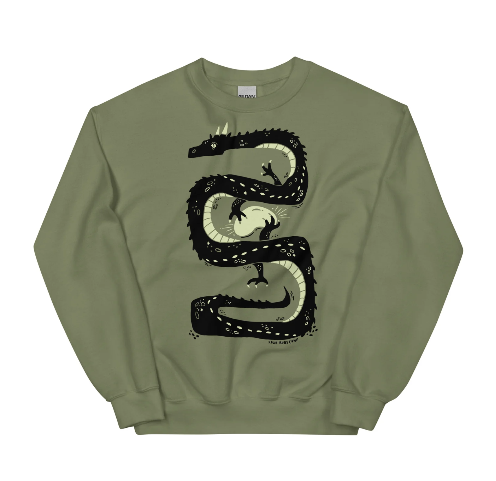
When I was working on the design for this conference t-shirt, I wanted to try to break away from the visual theme of the conference a bit and create a t-shirt that would be able to stand on its own. I also wanted it to represent this year’s conference well and remind attendees of their time at RubyConf Chicago.
When I was working on the design for this conference t-shirt, I wanted to try to break away from the visual theme of the conference a bit and create a t-shirt that would be able to stand on its own. I also wanted it to represent this year’s conference well and remind attendees of their time at RubyConf Chicago.
I began by thinking about how I could represent the year without using the literal numbers of the year. That is where I got the idea to look at the Chinese zodiac calendar. I discovered that this year is the year of the dragon and realized it was the perfect animal for the job! In stories, dragons are known to collect precious items such as silks, metals, and precious gems such as rubies. This was a great connection to the conference without leaning too heavily into ruby imagery. Additionally, dragons are sometimes associated with rivers, like the river in Chicago. Dragons are also just super fun to draw… who doesn’t want a dragon t-shirt??
So I began coming up with a rough idea of how I wanted it to look and feel by sketching on my iPad and looking at a LOT of pictures of dragons from Pinterest.
Here is a look at the sketching and iterating process:
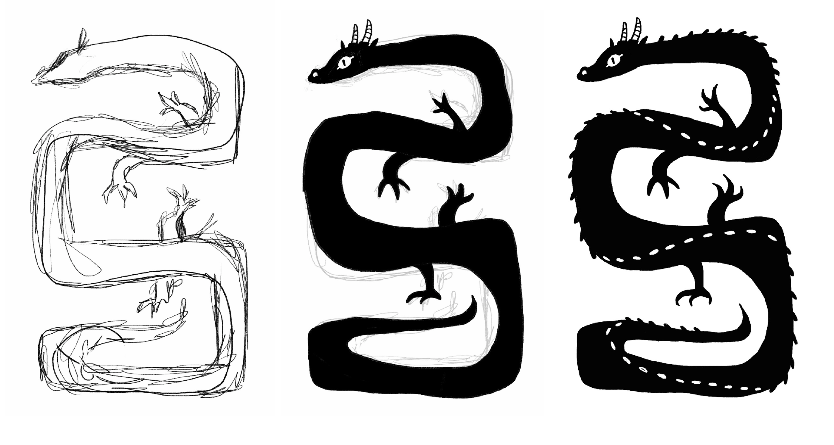
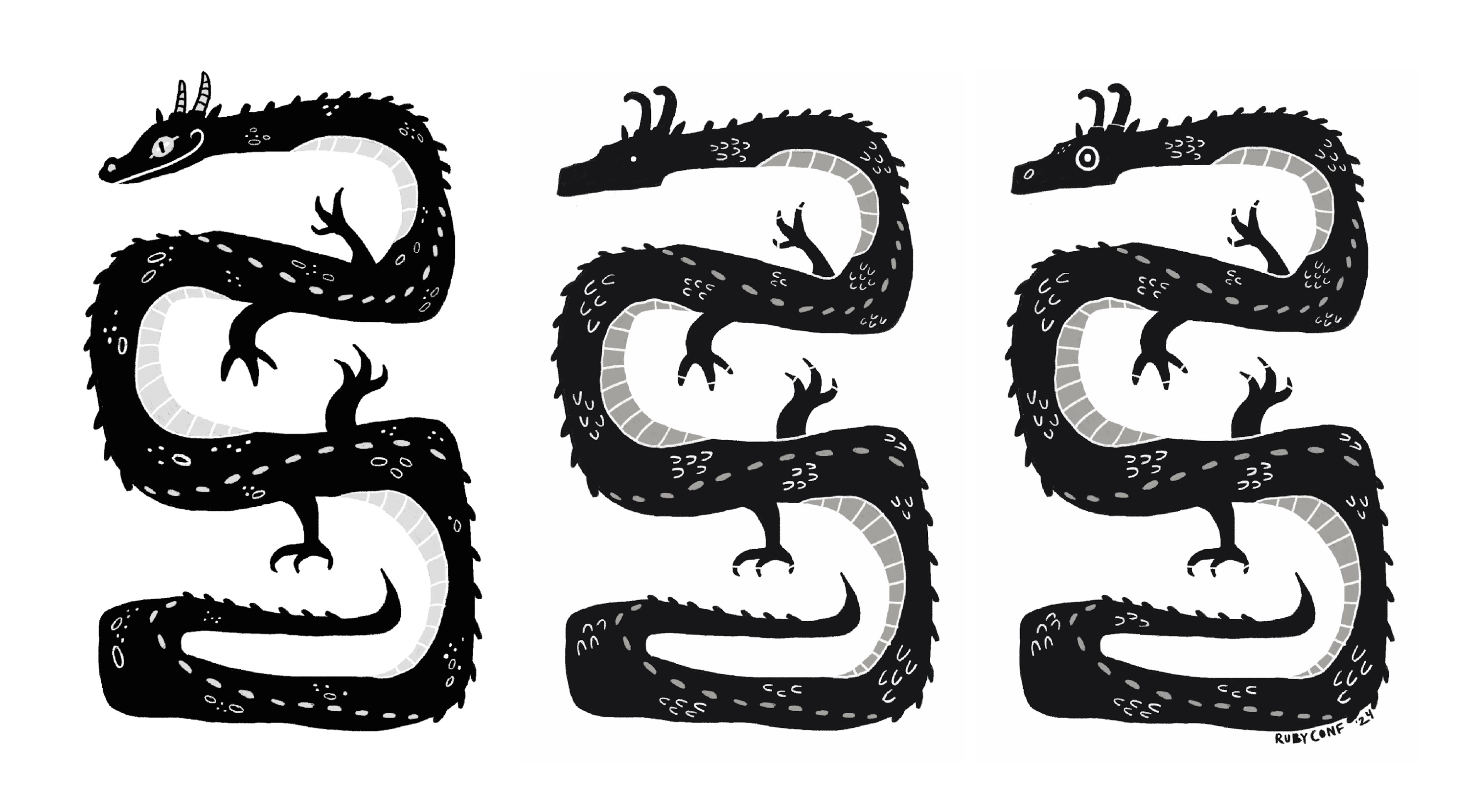
In the first sketch, I was just trying to find the overall shape of the dragon. Once I had that, I started adding scales and eyes, looking for the right feel. I tried several directions, changing the eyes, horns, and scales (at one point even adding a devious little smile😏) to see what felt like the best option.
Finally, I landed here on the direction for the design.
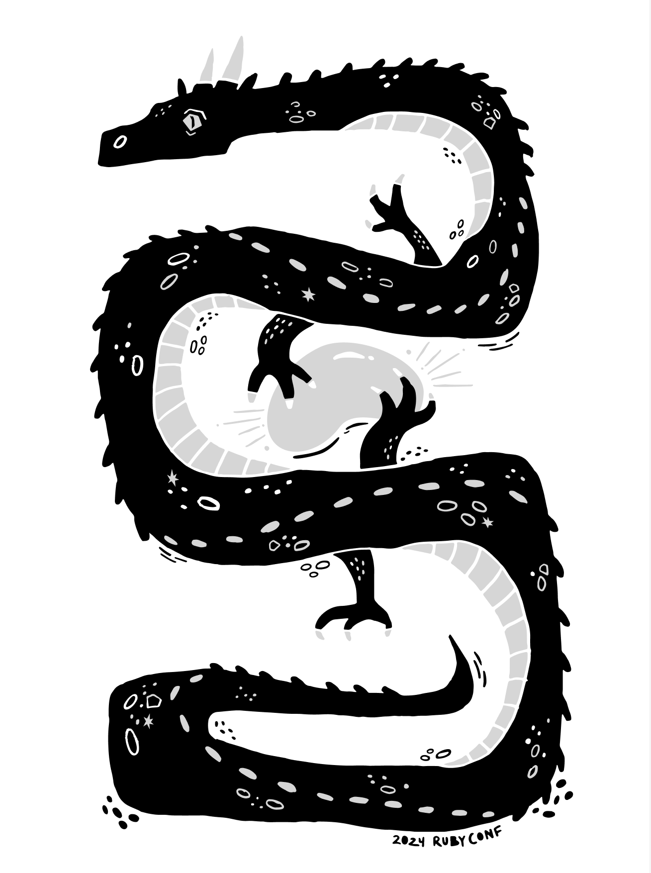
I liked how this dragon’s eye looked in this version, the horns and scales, and it felt more polished as a whole.
Within the design, there are a few hidden nods to Chicago and the Ruby community. There is the iconic shape that is ✨THE BEAN✨, of course, magic and sparkling. On a more subtle note, one of my fellow designers suggested that I bring in elements of the Chicago flag. The flag has four 5-point stars that we thought would be a cool addition to the design, so I have some hidden in the dragon’s final design. The dragon also has 6 rubies nestled into the design. Can you find all of these hidden elements?👀
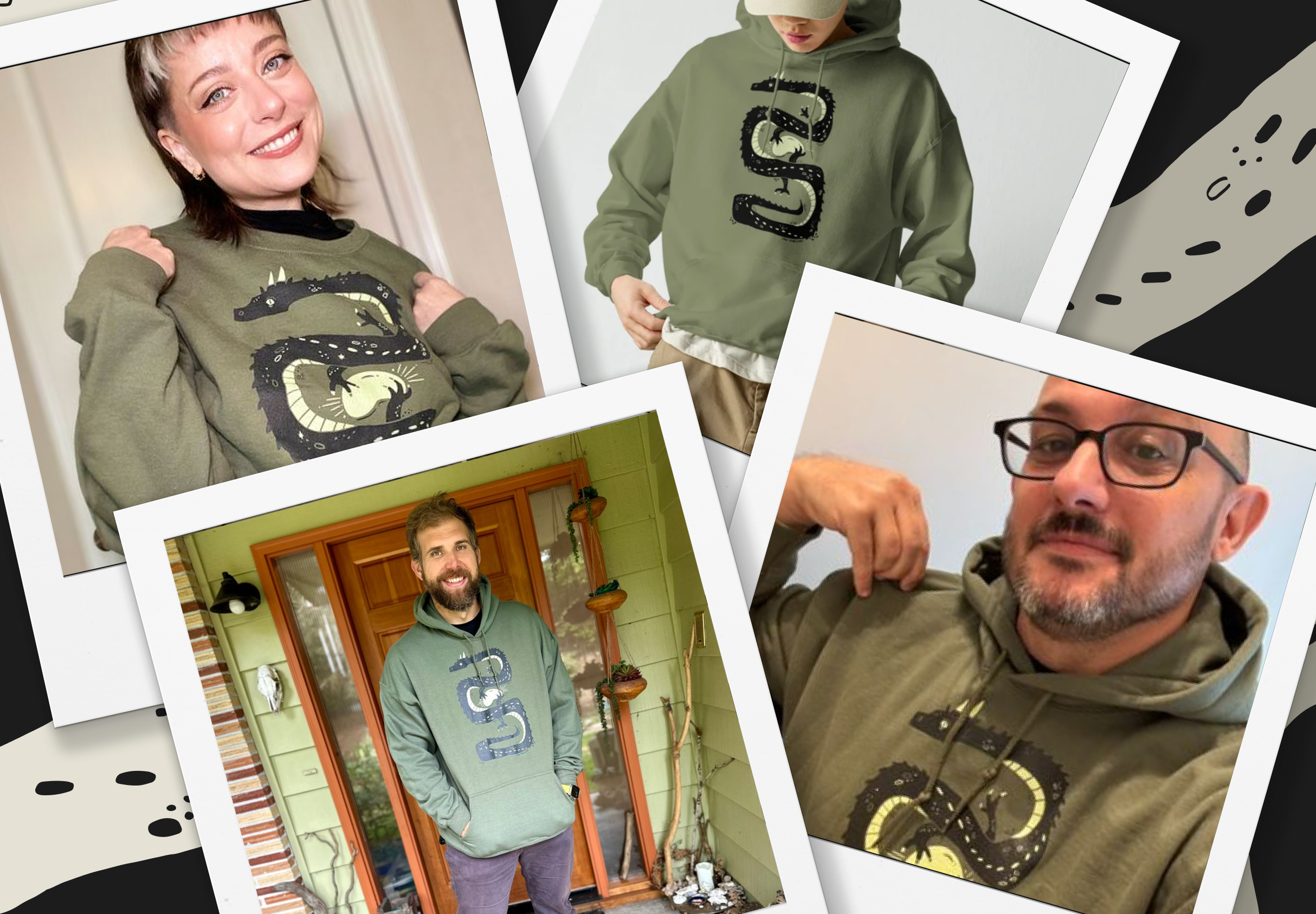
In addition to the shirts that were handed out at the event in Chicago, there are still versions of the design available to purchase online through Ruby Central. So if you have been thinking about how much better your life would be with a dragon t-shirt or sweater, don’t wait, GO BUY ONE NOW! Just kidding…unless??
I am super excited about the final result of this t-shirt design and I’ve loved seeing everyone with their dragon swag!
If you’re looking for a team to help you with your illustration and swag needs, get in touch.
If you’re looking for a team to help you discover the right thing to build and help you build it, get in touch.
Published on August 6, 2025
