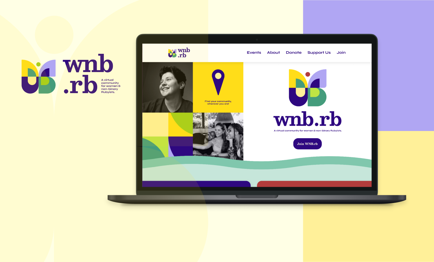
Visuals / WNB.rb
A refreshed brand identity and marketing site
WNB.rb is an online community for women and nonbinary Ruby enthusiasts to gather and give support. We designed a new brand identity and marketing site to better showcase their mission of building a virtual space for their members to thrive.
-
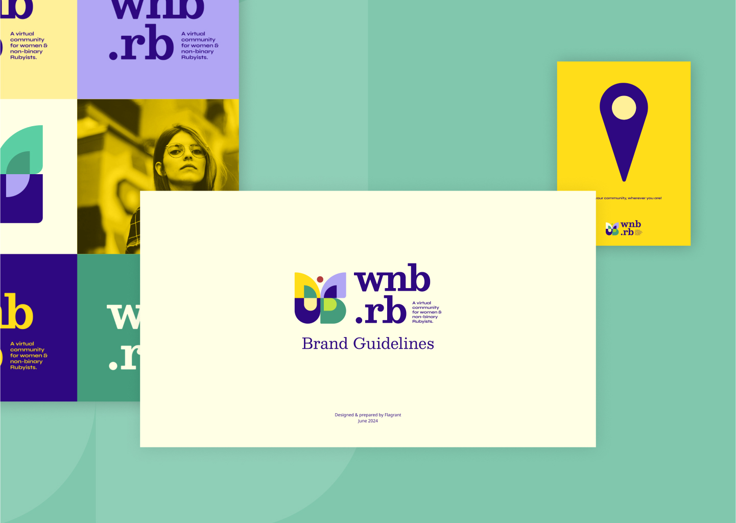
Redesigned brand identity
We wanted to build a brand that reflected the community that WNB.rb serves; a diverse group of individuals from many walks of life and levels of experience. We aimed to make a brand that feels open and inviting.
-
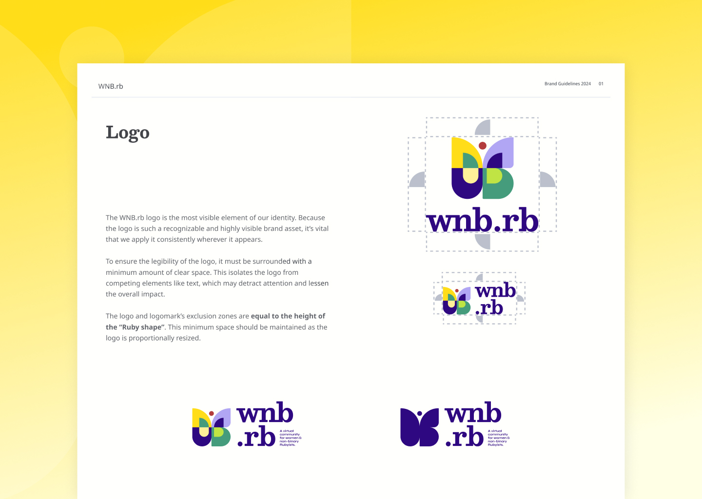
Tailored for community vibrancy
The concept behind the logo was to create a symbol of growth, renewal, and transformation. We also wanted the logo to represent the diversity of the WNB.rb community.
-
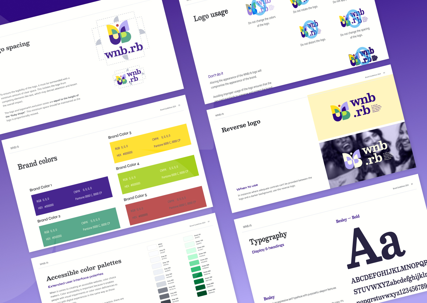
Style and brand guidelines
Providing WNB.rb with a guide to their new brand allows for consistent design implementation after the handoff from Flagrant.
-
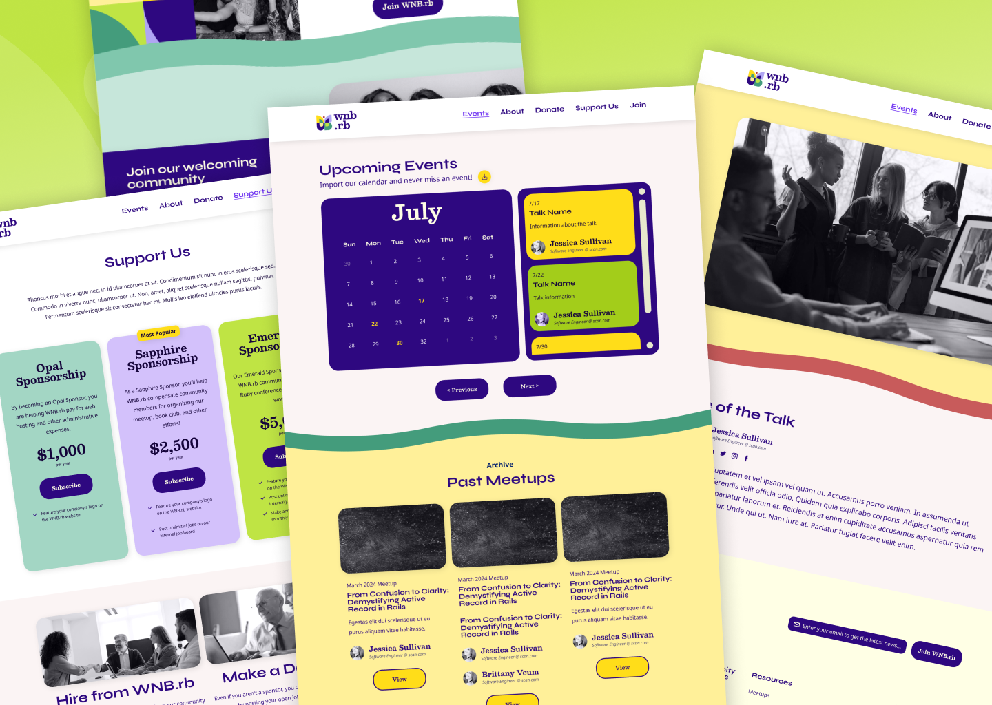
Marketing site spruced up
Along with getting a new brand look and feel, WNB.rb was also looking to refresh its website to better reflect its goals and function. Flagrant undertook this task and designed the new website from scratch.