
Visuals / Ruby Central
Branding redesign, document styling and brand asset creation
-
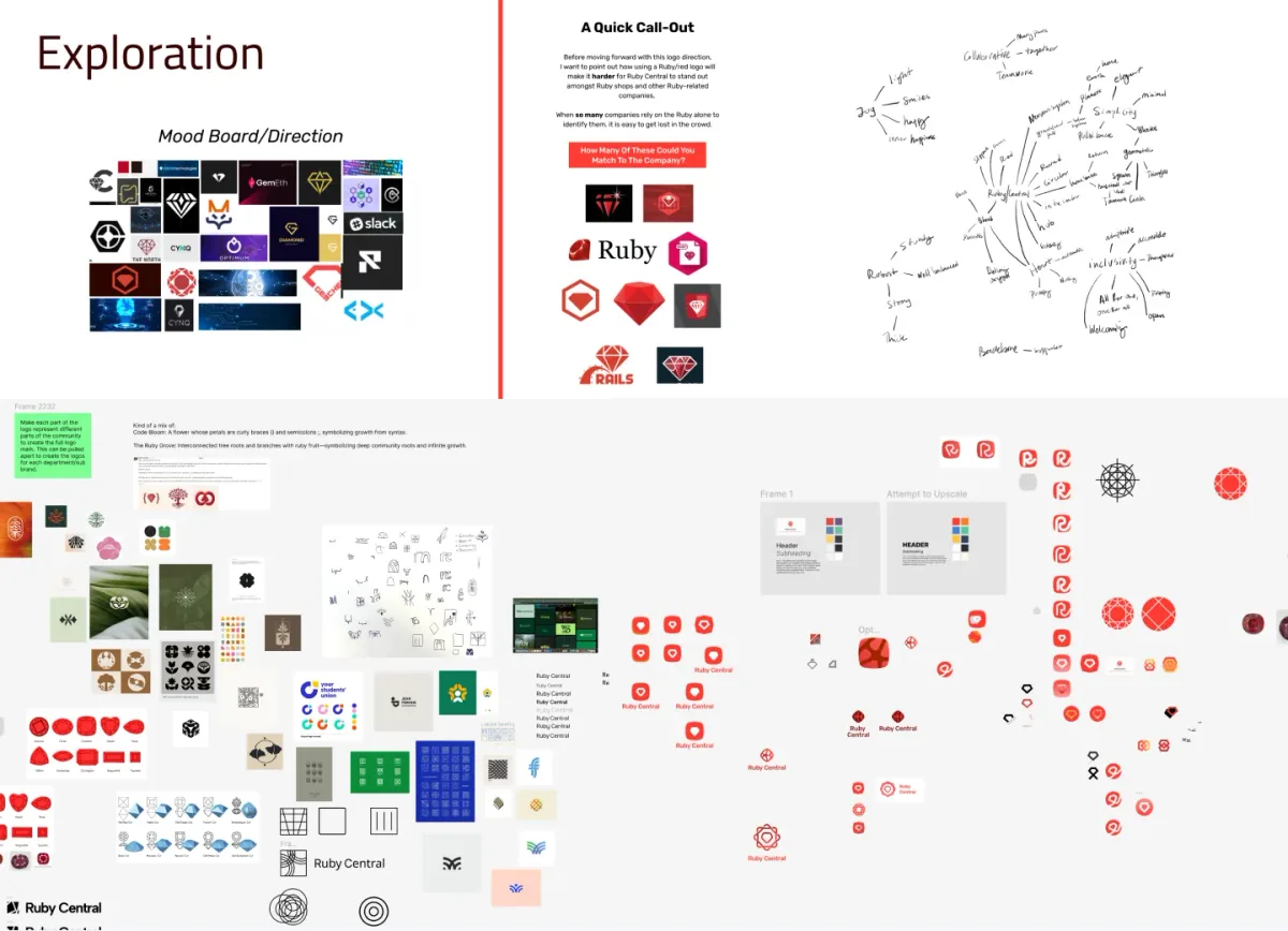
Exploration
During the exploration phase, we looked at ways to show the mission of Ruby Central visually and represent its core values through the brand. In the end, we presented two visual directions. One direction completely reimagined the brand colors, logo, and overall visual style using the analogy of Ruby Central as a garden where Rubyists come to grow and be supported, with Ruby Central there to tend and provide resources. The other direction kept closer to the existing Ruby Central brand, with tweaks to colors, slight changes to typography styles, and a new logo system that spoke to community and support, keeping Ruby at the center. Ruby Central chose the second option as it felt more in line with their current mission.
-
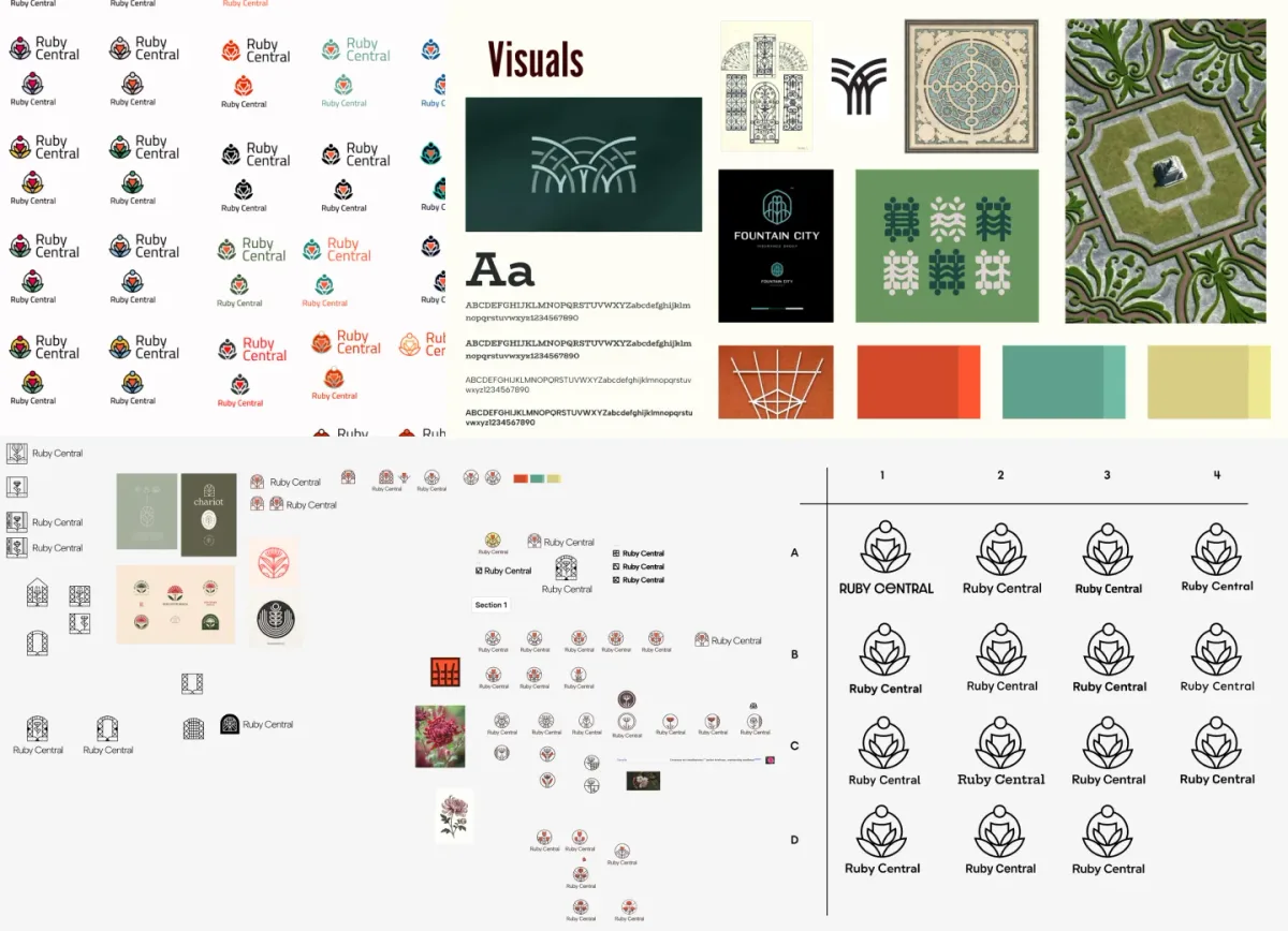
Brand direction #1
This direction focuses on community, growth, and a culture of cultivation. Ruby Central is a place where people can learn at any stage in their life, from bud to plant: how to grow, thrive, nurture and support. This concept positions Ruby Central as a place to find other people who care about developing and sustaining a “green thumb” in their programming career and community. This concept’s rich visual language is strong and bold, while still being technical, and provides a way to pivot away from commonly used stone shapes and red color schemes.
-
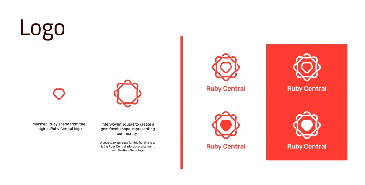
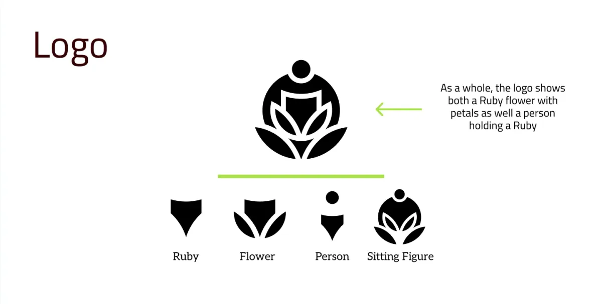
Brand direction #2
This direction took Ruby Central’s current logo and makes it more modern and clean. We also wanted to create some more visual interest and have elements that we can expand into an entire brand. This brand direction uses the existing color palette with a few tweaks and modifications to the typography.
-
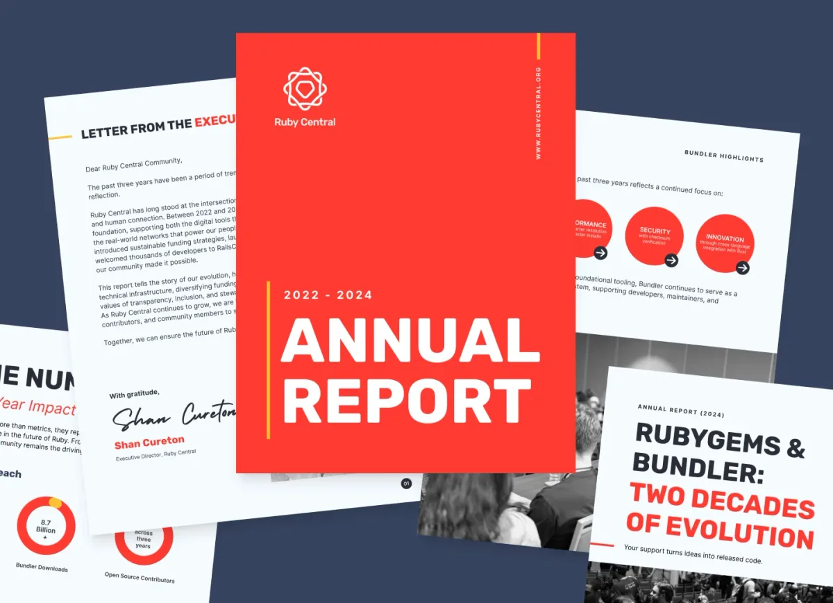
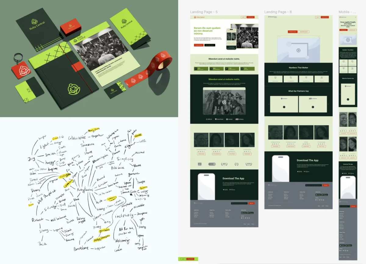
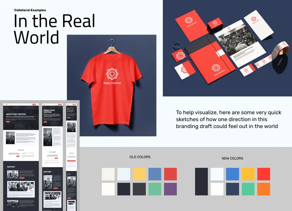
New branding applied to Ruby Central documents and public communications.
Ruby Central chose the second direction—to modify their existing logo and adjust colors to be more cohesive. These are some samples of the brand application across various assets in the Ruby Central system, including their Annual Report.


