
Visuals / Improv Effect
Turning improv’s spark into a digital experience
-
Bringing Improv Energy to the Web
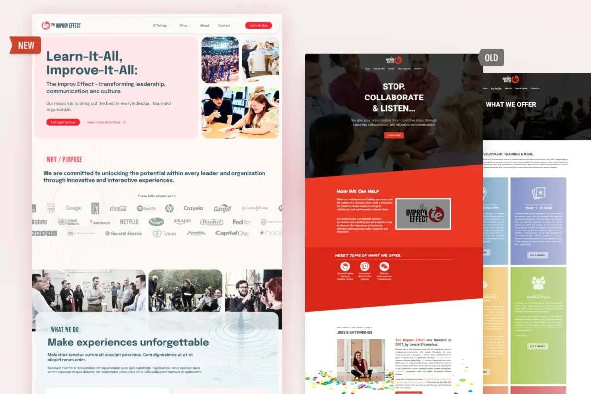
The old Improv Effect site worked, but it felt heavy and a little too serious. Dark reds, long bios, and text-packed service blocks didn’t capture the lively, human spirit of improv. The redesign lightened things up with a fresh palette of pinks, reds, and blues, paired with bold but approachable typography. Services are now easy to skim, bios celebrate real people, and the contact form feels like a genuine invitation. Behind it all is a flexible design system—colors, type, UI patterns, and playful details—that makes the site consistent while keeping its personality intact. The result? A digital presence that’s professional, clear, and full of the same energy The Improv Effect brings to the stage.
“From the start, working with Flagrant felt like a true partnership in every sense of the word. Whenever I felt stuck or overwhelmed, Kelly encouraged me to step back, take a break, and then work together to find the best solution. Her support made all the difference and kept me from going absolutely bananas throughout the process!” Jessie ShternshusCEO and Founder, Improv Effect
 -
From Dated to Delightful
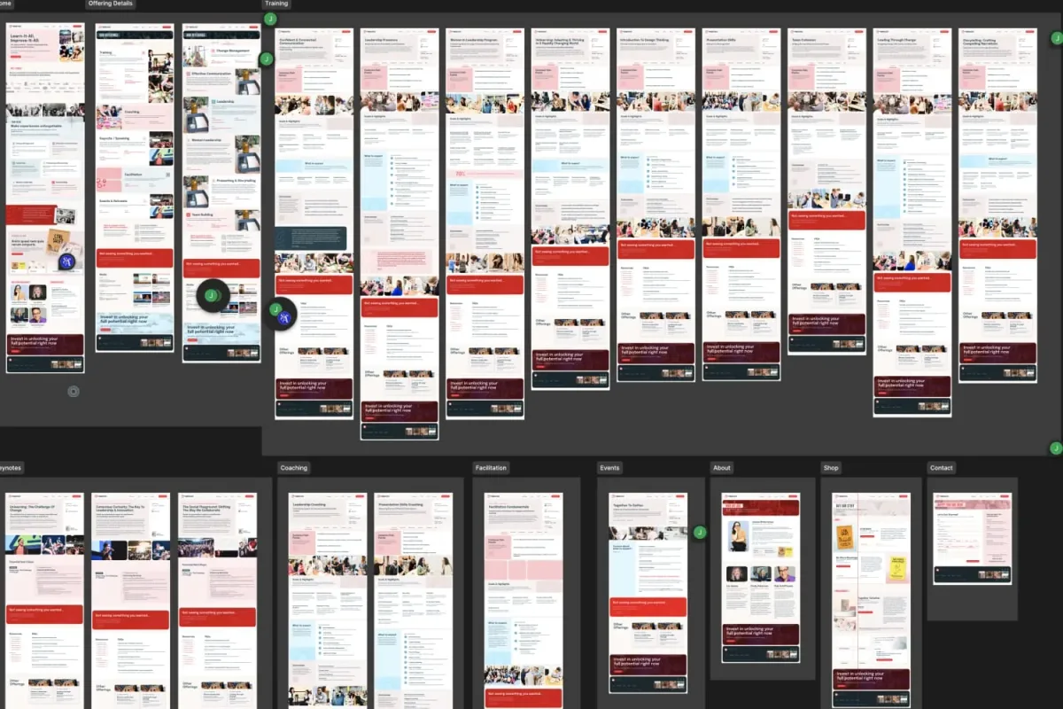
Instead of piecemeal updates, we built a design system: color, type, layouts, UI elements, and reusable page patterns. The result? Every page feels like it belongs to the same family, but still has enough flexibility to show off different services, events, and resources. It’s polished, but not stiff; playful, but not chaotic. The site doesn’t just tell you what Improv Effect does—it *shows* you, with energy, clarity, and personality baked into every page.
-
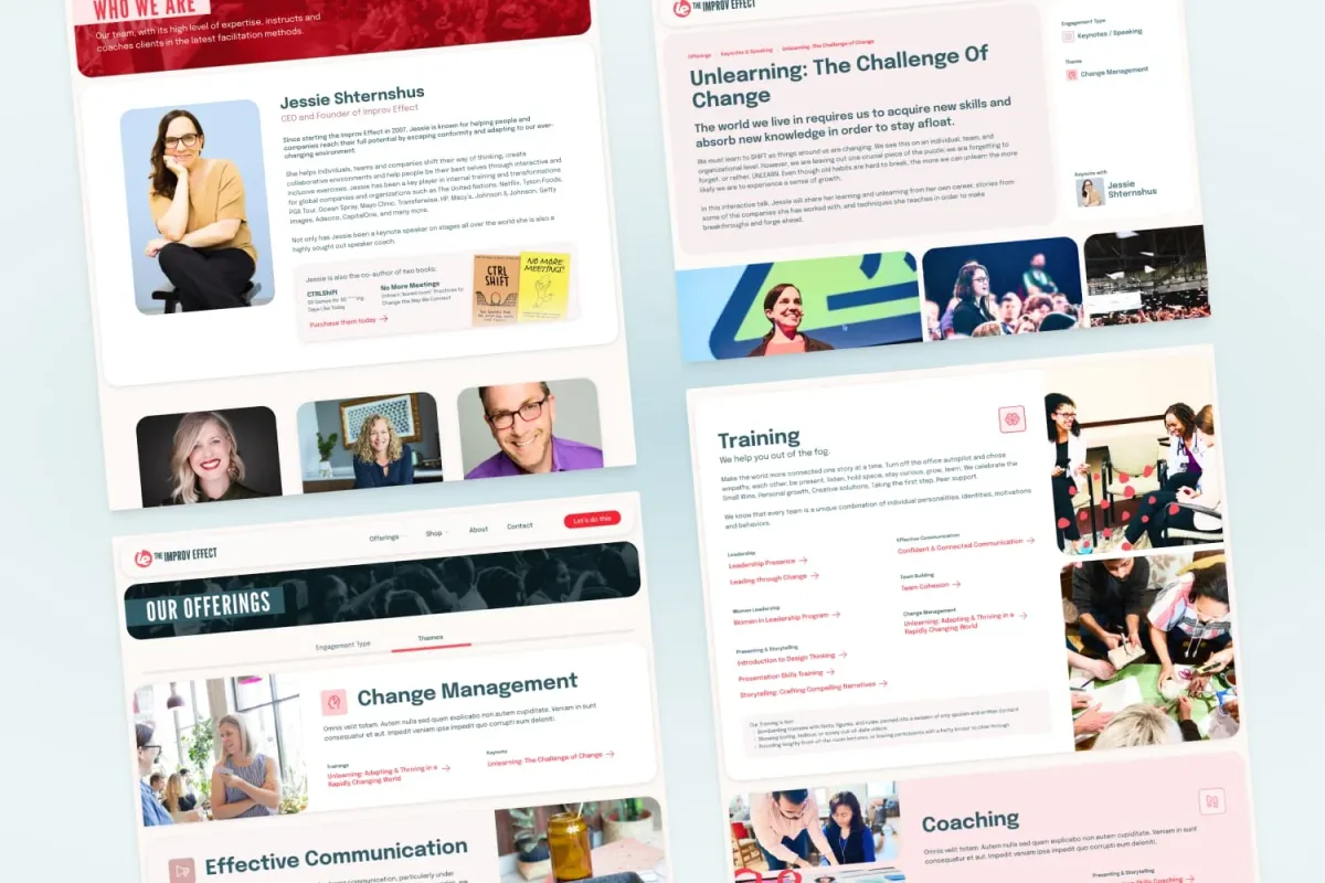
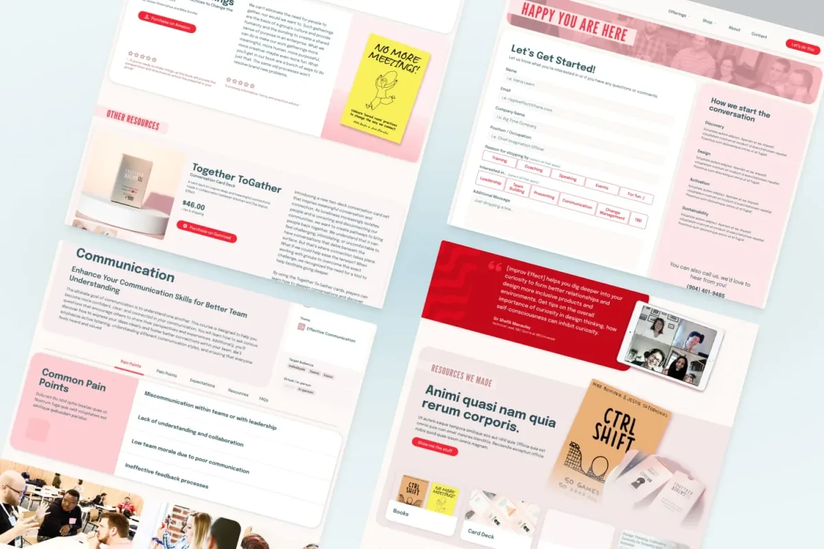
From Résumés to Real People
The old site had pages that all felt a bit different from one another. Now, we’ve got a clear system. You can see in the flow maps: every service, training, or keynote page follows the same rhythm—hero headline, supporting visuals, key highlights in callouts, and a clear CTA at the bottom. That consistency makes the site easier to navigate and keeps the brand voice strong. The about page design celebrates the people. Jessie’s story feels human and approachable, and the facilitator grid makes the team look dynamic and full of personality. You’re meeting people, not just reading bullet points about them.
“Flagrant’s culture is playful, non-judgmental, and full of heart, which really resonates with me. This can be a vulnerable process and I felt comfortable knowing Kelly was right there with me—skipping down the winding path, laughing through the missteps, and making up ‘doodaly-beep-boop-bop’ songs along the way.”Jessie ShternshusCEO and Founder, Improv Effect -
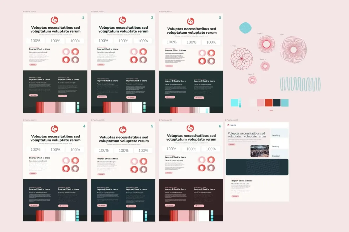
Color Exploration: Building the Mood
Before diving into full pages, we sketched out different layout variations. Each round tested how color blocks, buttons, and illustrations could play together. This step let us experiment without committing too early, so we could see which balance of white space, color, and structure best captured the brand’s energy.\ \ Instead of shouting with a single shade, the new palette gives us range: soft neutrals for background, bold accents for calls to action, and cool blues to balance the warmth. This mix keeps things professional but still playful.\ \ The old site’s text felt dated and heavy. Now, we’ve got a pairing that works: League Gothic for those big, bold headlines that grab attention, and Epilogue (in Bold, Semibold, and Medium) for body copy that’s clean, approachable, and super legible across devices.
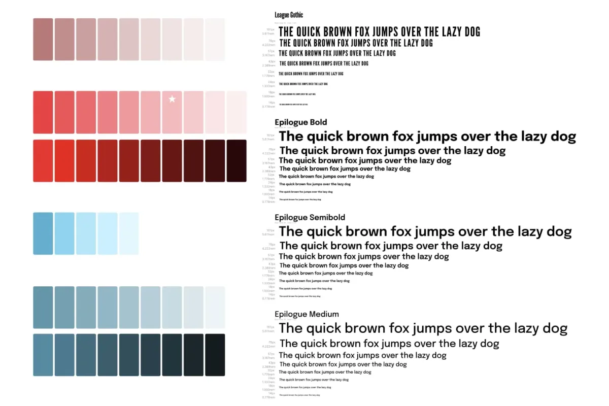
We went from a limited, heavy palette to a flexible system of pinks, reds, and blues. And the type is now the right mix of authority and friendliness.
-
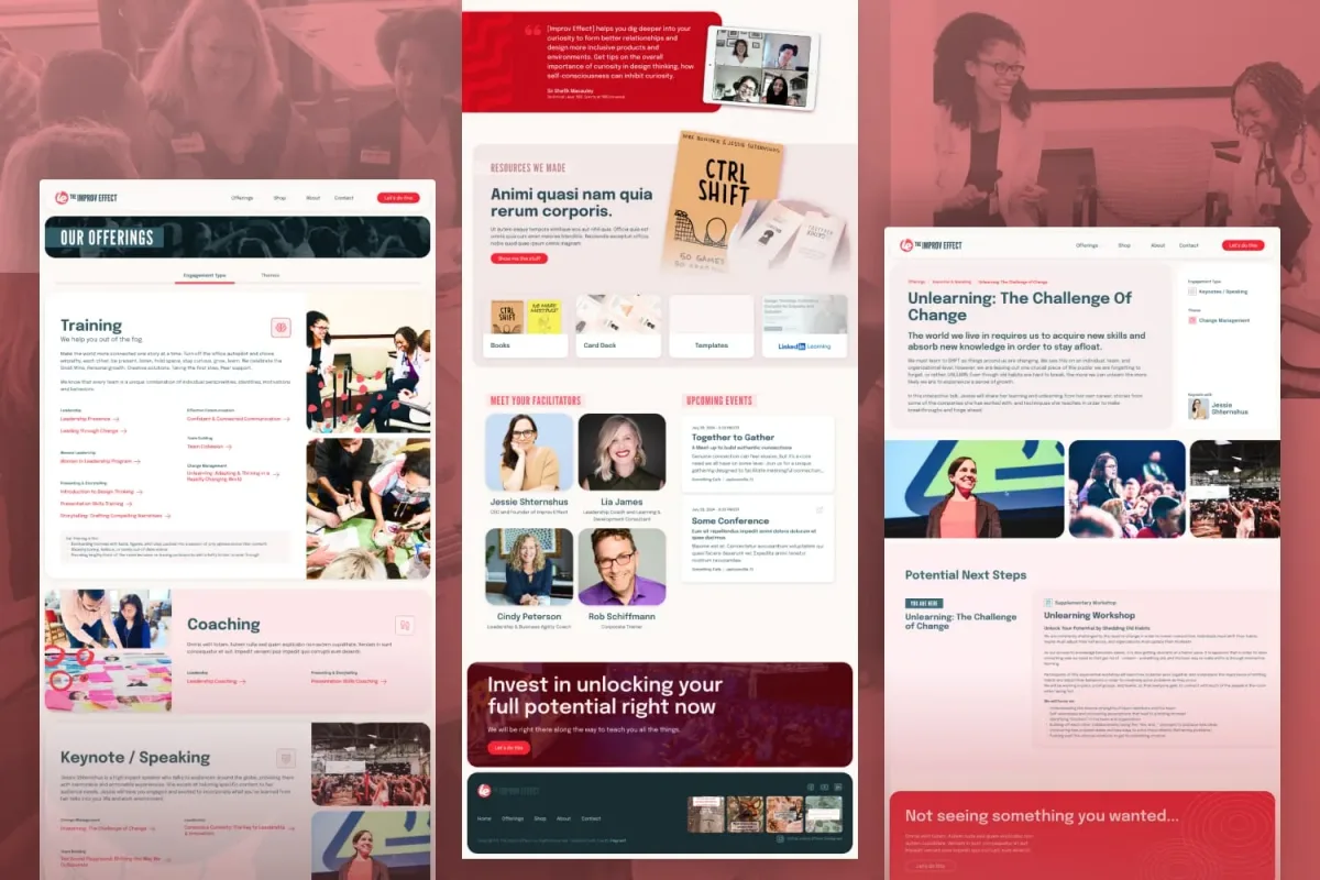
Goodbye Clutter, Hello Clarity
The old services page was a wall of bright-colored blocks stuffed with text. It was hard to know where to start, and your eyes got tired before your brain even kicked in. It was easy to get lost in paragraphs without really absorbing what was special. The new version is crisp and organized. Clean cards, tabs, and themes make it simple to explore. Want training? Coaching? Keynotes? Just click and go. It feels like browsing a modern app instead of digging through a dense catalog.\ \ Beyond the basics, we built in little design “moments”—circular graphics, layered patterns, and abstract shapes. These details add texture and personality, so the site doesn’t feel like a corporate template. They’re subtle enough not to distract, but just enough to give the design some spark.
Before diving into full pages, we sketched out different layout variations. Each round tested how color blocks, buttons, and illustrations could play together. This step let us experiment without committing too early, so we could see which balance of white space, color, and structure best captured the brand’s energy.


