From 0 To 60 In Brand Design.
How I approach and create a small brand from scratch in a day.
For any blank canvas or creative project, everyone approaches it differently. When a client asks me to create a brand for their new idea, I have a general way I go about designing.
In order to reveal some of the design mystery, I will share my end to end process.
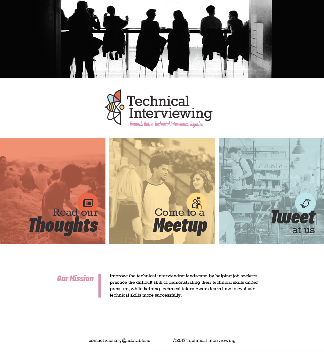
My client, a coworker, wanted to create a space for people to learn how to give or receive technical interviews. It was important to convey with this brand that it’s a welcoming, diverse and a professional resource to everyone on the spectrum of interviewing. He wanted to have a web presence that included a one-page website, a meet up, a blog, and a Twitter account.
In some cases, clients have some idea of what they want. In other cases, they come to you with the hope that you will rock it and steer them to greatness. Both are hard to do.
When they know what they want, it can take a while to hit the mark they have set. If they have no idea, the lack of restriction can become overwhelming. In this project’s case, I had a lot of freedom.
He told me he liked the idea of having a “techy”-looking font for the word — technical, and wanted to present a softer side by incorporating a more handwritten font for the word — interviewing. What I interpreted from his idea is that he really wanted to leverage the idea of a more personal/softer take on something that can be very sterile and impersonal while still targeting tech industry professionals.
Name: Technical Interviewing
Collateral: Website, social media images, digital banners
Starting Out: Get a Picture of the Work Ahead of You
When I begin a new project, I have a tendency to start with a Google image search so I can do a sweeping overview of what people think of the words “technical” and “interviewing.” Gears, blueprints, and circuit boards come up on the search for “technical,” and “interviewing” had business suits and handshakes.
This may not be a true sense of what everyone thinks of when you say “technical” and “interviewing,” but it’s a quick overview of visual representations and patterns. It validated my hunch that the general population think of interviews as a thing the stuffy suit-wearing people in corporate America engage in.
I tend to go into my sketch book pretty quickly. I produce a few thumbnails, small sketch studies, just to see if there are any happy accidents. I started by thinking that I want to create a logo mark. I think that, when successful, a mark is more memorable than typefaces alone.
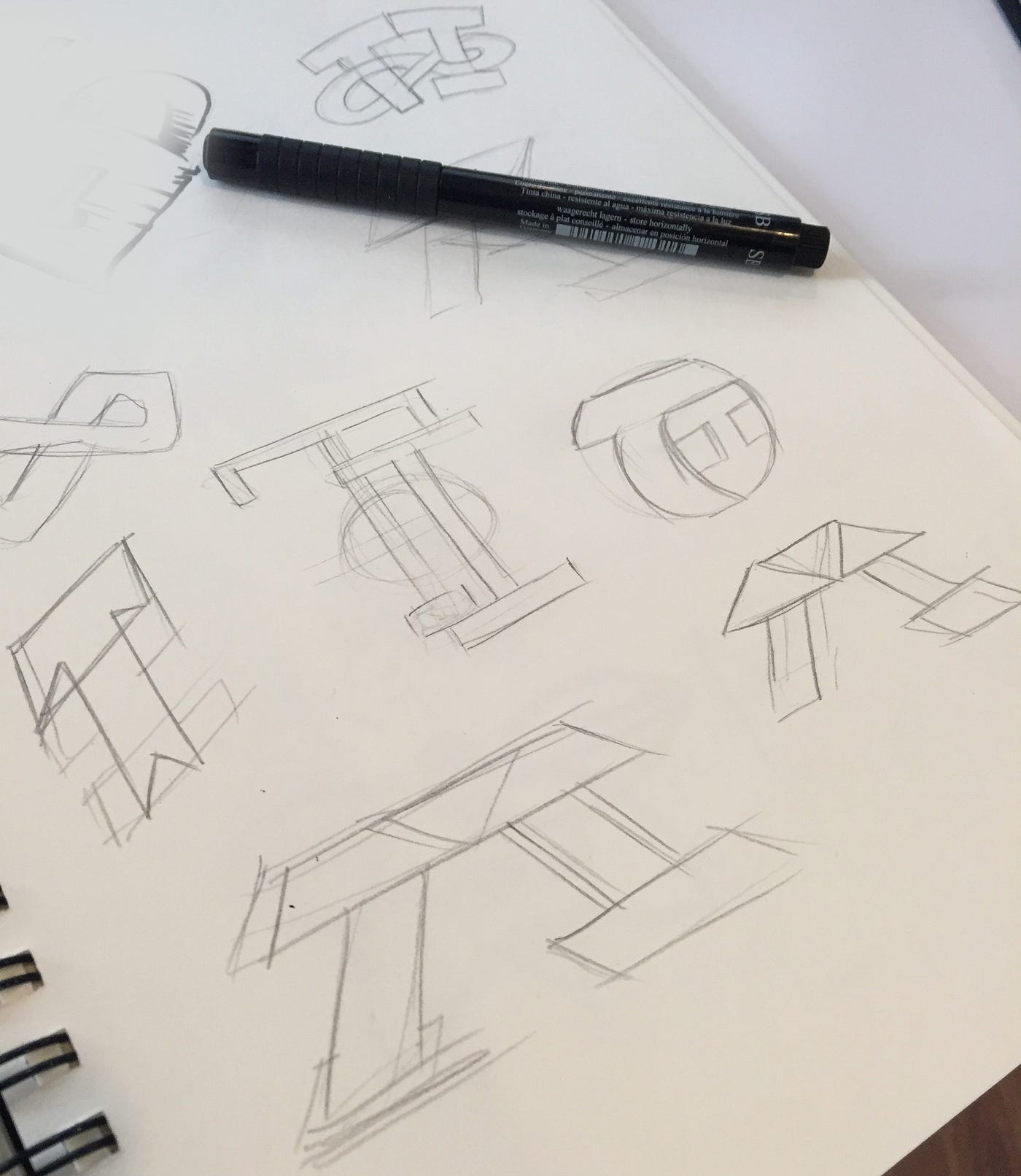
What would work in a square or what the “T” and “I” — the first letters of the brand words — look like? What happens when the letters overlap?
While drawing them overlapping, I thought of a conversation that I had with my client. He indicated that his mission was to help people who are in charge of hiring or who give interviews the chance to get better by working with the very people who want to learn how to prepare for interviews.
Using this platform to build up people on both sides of the table. One could call it a symbiotic relationship… One helps the other… Equally…
Back to Google image search.
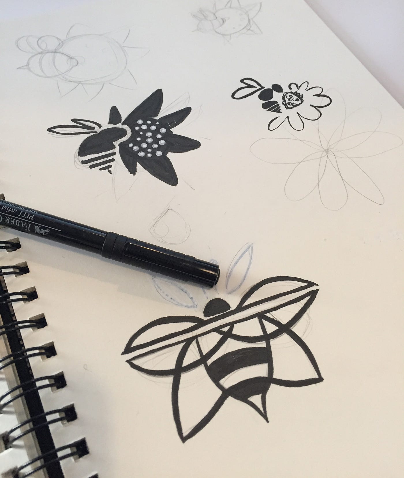
Images of cows with birds on their heads, sharks with fish attached to their underbellies, parasites with hosts, bees pollinating flowers. Yes, all of these are examples of a symbiotic relationship, but some of them have undertones that I do not want to express.
For example, a bull with birds on their heads and the sharks with pilot fish are visually unequal. One large animal that dominates the other. I don’t want to accidentally create that dynamic in the visual representation of the brand. I also don’t want to use the parasite/host visual either.
But there was some magic in the bee and flower pair that got me drawing those two in harmony. They equally need each other. Mutual benefit for both things and proportionally they can be a similar size. A bee helps to pollinate while being able to feed. A interviewer helps to teach and bring back ideas to their company. The pollen allows the flower to grow and spread. An interviewee can learn and find a new job.
Back to sketching.
I want to use simple shapes because I don’t want to make this mark complicated. I think of the structural lines from the blueprints in the first image search. I rummaged through Dribbble for some inspiration. I liked the idea of the flower and bee becoming one thing. Using lines that create the wings which turn into the lines of the flower petals. I also don’t want the mark to be overtly a bee or a flower since this is just an appropriation of idea of a symbiotic relationship.
From Idea to Production
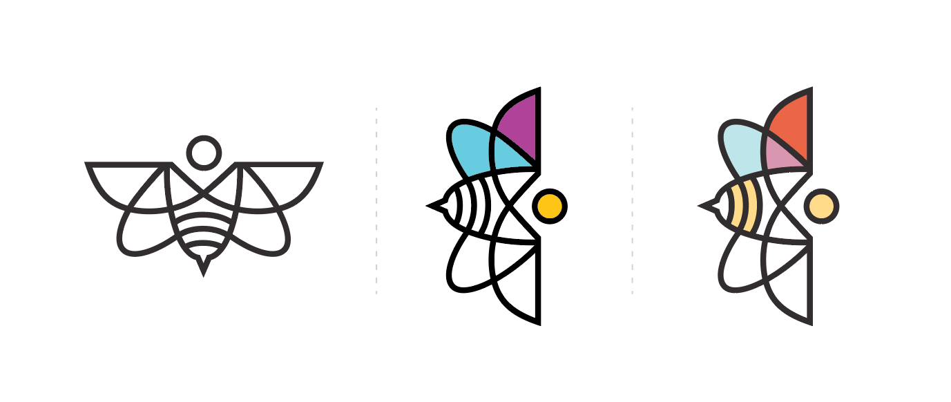
Once I’m happy with a rough sketch I bring it into Adobe Illustrator. I use the pen tool to create the shapes with just a black stroke to maintain consistent line weight and look. A lot of the shapes originate out of cutting circles and ovals in half with the pathfinder tool (a very amazing tool, BTW) in order to keep symmetry.
I flipped the mark on its side because I wanted the motion of the bee going into the flower from left to right, similar to reading a book.
When I am satisfied with the outlines, I start to think about color.
What types of color I should use based on the client’s request to make sure that his brand is welcoming to all? What kind of colors can set this apart from what I saw in the “technical” Google image search?
I dabble with bright cyan blues, purples, and a golden yellow. These colors are all really saturated and convey to me what ALL CAPITAL LETTERS do in text. What happens when I pull back on their saturation? Once they are more subdued, it becomes easier on the eyes. I bring in a red to represent the flower, blue to represent the wing, and yellow for the bee (muted primary colors).
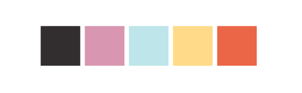
These colors vaguely remind me of going to school. The purple is the mix of both flower and bee. Similar to the colors of the fills in the mark, I tone down the black of the outlines.
To keep the mark simple, I only chose to color half of the mark. I do this because I don’t want the colors to demand all of the attention. I want the mark to have equal weight to the type that is to come.
Font selection is something that takes time.
There are many sites that you can find fonts — fonts.com, fontspring.com, typekit.com. You can also look at font foundry sites, as well. It’s like getting farm-to-table fonts. For this particular project, I looked at fontsquirrel to find a free commercial font. Not all clients have budgets with font prices in mind. Generally I select one typeface for the logo and a secondary font for the rest of the collateral, like body text on a website or headliners.
Fonts play an equal role in the feel of a mark.
When selecting a font I want one that could be seen in the same visual wheelhouse as the mark. So when I’m looking for a font, I want to keep in mind the thickness of the letters in comparison to the mark. I want the same roundness from the bee’s head. I download a bunch of fonts that fit that bill and place them individually next to the mark until I find one that have the font weight and roundness I was looking for.
I settled on a font, Rokkitt. Rokkitt is a newer slab serif that has the right amount of thickness and the letter forms are circular. The font reminded me of a typewriter font that you would find in vintage guide books.
Not all fonts, especially free fonts, have letters spaced to accommodate all possible letter pairs. In the case of my text, I needed to manually kern — adjust the space between letters — to finish up the type part of the mark. Usually, when you have a circular letter form next to a straight letter form, there will be a visual gap that you don’t get when a straight letter form is next to another straight; same with two round. In “Technical Interviewing,” the “i”, “e,” and “w” in “interviewing” needed to be tightened up.
Letter forms can be exactly equidistant from each other but seem visually off, so you will find that you might have to manually adjust these things, even when a font includes kerning pairs.
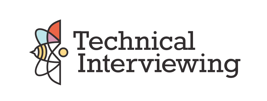
The client had a tagline that he wanted to incorporate into the logo mark. I selected a condensed sans serif font, Program, that complements and contrasts the round shapes of Rokkitt. This font allowed me to have a variety of weights and italics for subheadings and headlines.
Once everything was tweaked and settled on the logo mark, I shifted to collateral design.
The client asked for a one-page website to be the hub for all of links to social media, the blog, and meet ups. Since this is in its beginning stages, there are no photographic assets to draw from. A great resource for free commercial photography is unsplash.
I looked for images that depicted groups of people engaging in everyday conversation. I wanted to enforce the client’s mission: to bring people together in a stress-free environment. Show that interviews don’t have to be the cold, stiff version that everyone seems to experience.
Since the one-page site is very minimal, I wanted to create big buttons for the outgoing links that were bright, bold, and told you to do something. These calls-to-action are important to direct traffic. I created icons from some free icon sets to echo the logo mark and draw visual attention to the buttons. In addition to calls-to-action, I wanted to have a place for the client’s mission statement. And at the end: a place to contact the client.
My whole process can take a day (8 hours) if all of my “design stars are aligned.” Add on more time if the client requests iterations, if the collateral is more significant, or I am having a brain-farty day.
My cheats codes are:
- Use Google image search just to nudge you in a direction in the beginning
- Draw thumbnails for a while
- Mind map words that don’t have a known visual, or look up synonyms
- Scan type websites and collect ones that you like
- Look at design sites like Dribbble for inspiration
- Try Adobe Kuler for color pairings
- Mess around with shapes in Adobe Illustrator/your vector program of choice with the pathfinder tool
- Enjoy the process
Hope this help give insight into design reasoning — or at least one designer’s version.
If you’re looking for a team to help you discover the right thing to build and help you build it, get in touch.
Published on April 24, 2017
